> ## Documentation Index
> Fetch the complete documentation index at: https://juo.io/docs/llms.txt
> Use this file to discover all available pages before exploring further.
# Customize widget
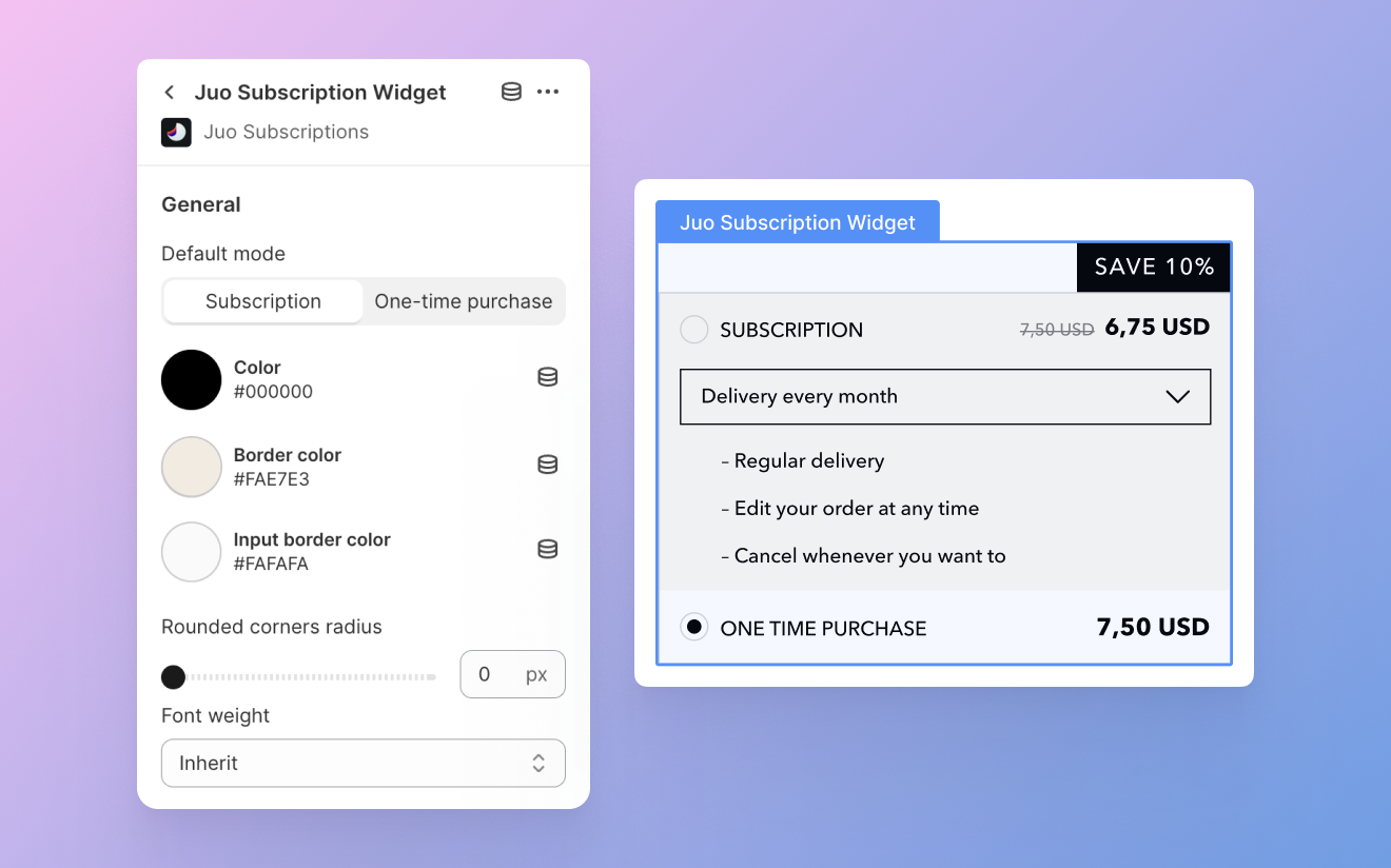
The Juo widget comes with flexible customization options that allow you to tailor its appearance to match your Shopify storefront. To get started with customization, go to your default Product page template and left-click on the Juo Subscription Widget. This will open the settings panel, where you can adjust the appearance of the widget to your current theme.
## General settings
These settings apply to the overall appearance of the widget, including its style, corner radius, font weights, various color settings, and spacing above and below the block.
### Widget style
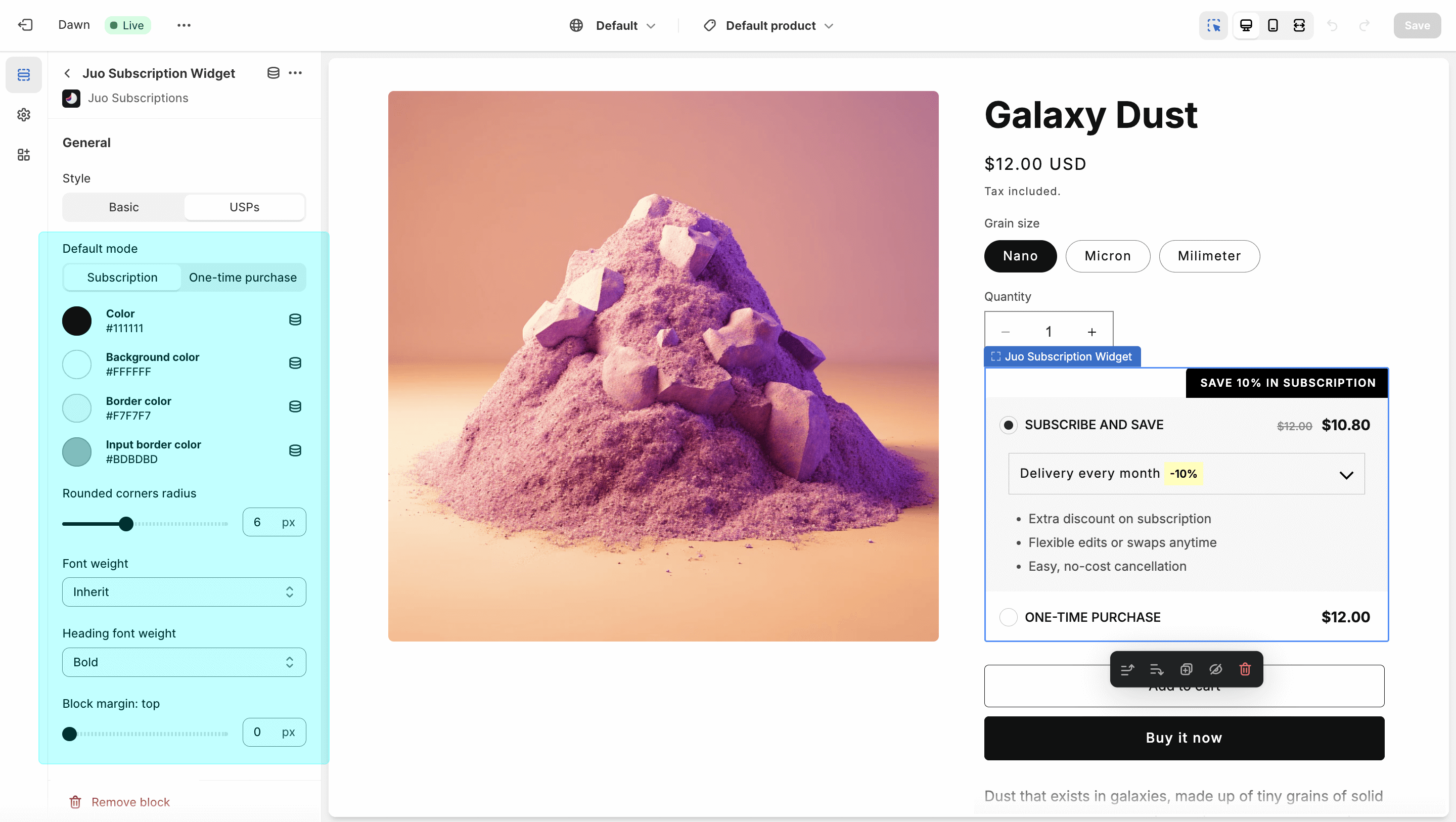
You can choose between two widget styles: Basic and USPs. **Basic** offers a clean and simple layout suitable for most storefronts. **USPs** includes more visual emphasis, with decorative fonts and a dedicated highlight for the subscription discount.
Some settings apply only to specific widget styles. These options will still
appear in the settings panel, but if they aren’t compatible with the selected
style, they won’t be visible in the theme editor preview.
### Default mode
Choose whether subscriptions or one-time purchases are selected by default in the widget. Select the option that best fits your store’s strategy.
### Colors
You can customize several color settings for the widget:
* **Color** — sets the font color used throughout the widget
* **Background color** — sets the background color of the widget (only for the USPs style)
* **Border color** — applies a border color to the entire widget
* **Input border color** — sets the border color for the delivery frequency selector
Additionally, you can customize the appearance of subscription and discount badges, and define different background colors for subscription and one-time purchase options (Basic style only).
### Corner radius
Match the widget to your store’s design by adjusting the corner radius. This affects both the main widget block and the subscription badge. Use the slider to set a radius between 0 and 16 pixels.
### Top and bottom margin
Use these settings to adjust the vertical spacing between the widget and surrounding elements.
**Block margin: top** increases the spacing above the widget, while **block margin: bottom** increases the spacing below it.
## Subscription badge
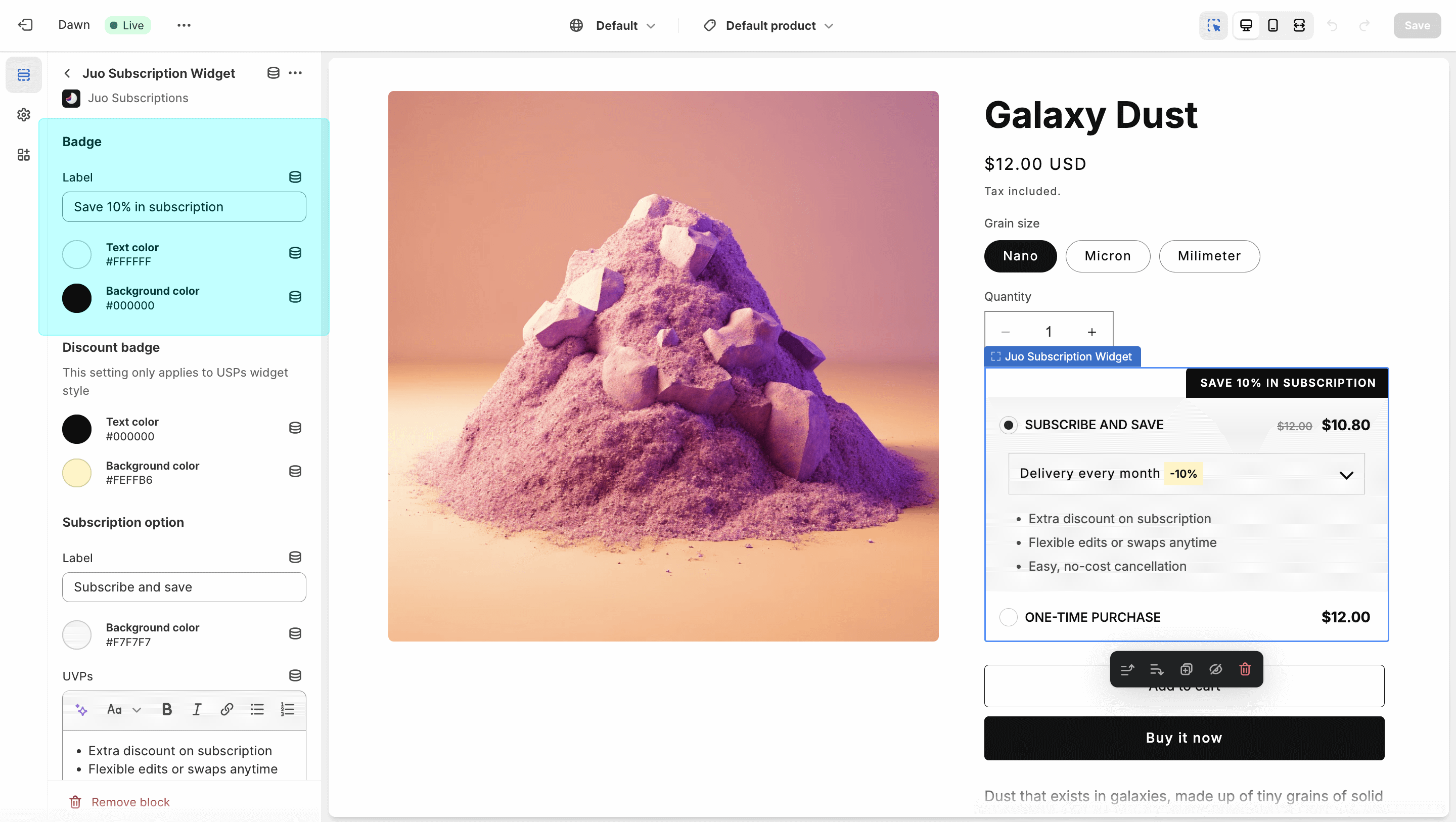
You can modify the label and color scheme of the badge shown above the subscription widget. Be sure to use contrasting text and background colors for visibility. To hide the badge entirely, leave the “Label” field empty.
## Discount badge
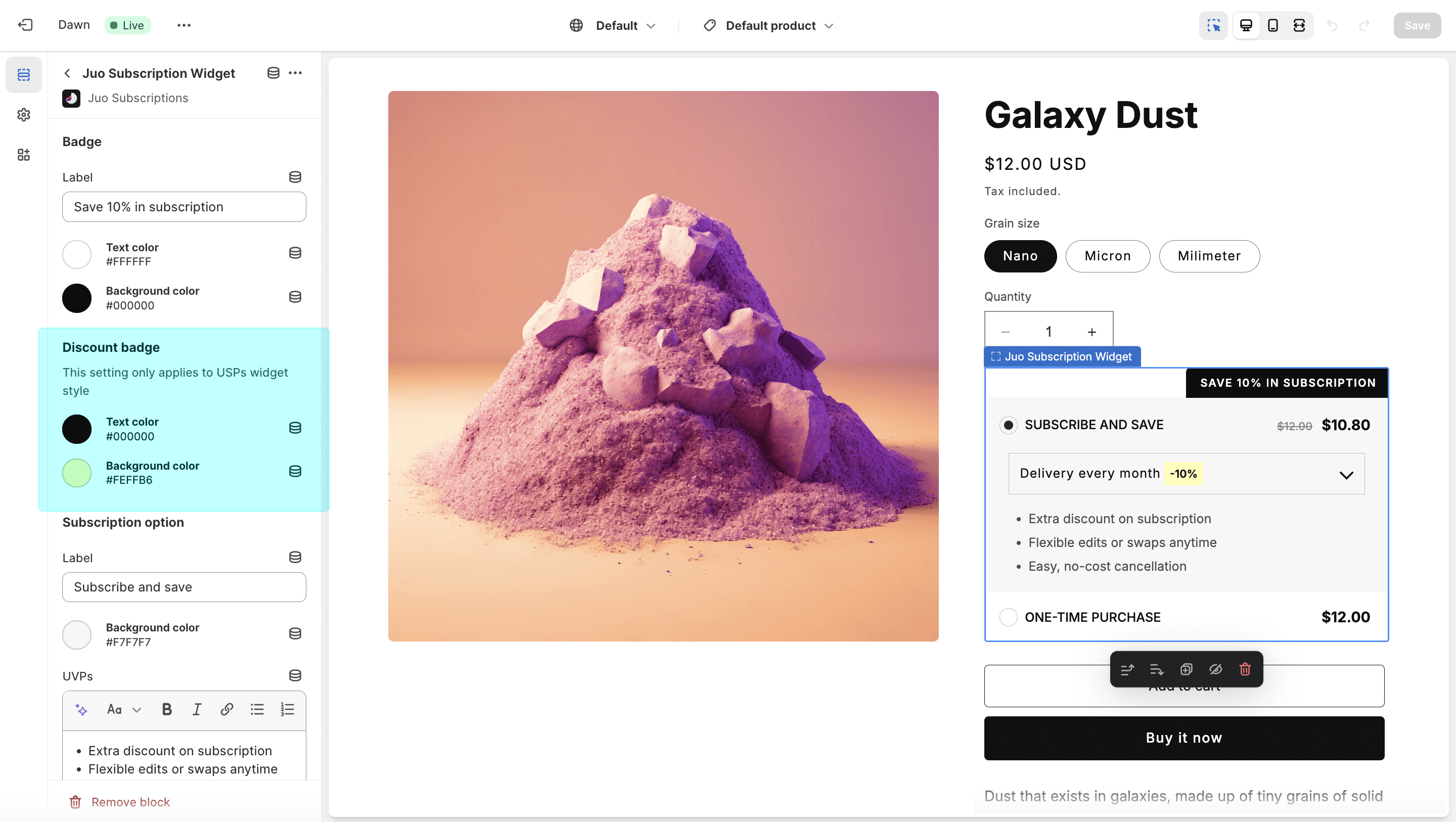
This option is available only for the USPs widget style. It highlights the subscription discount next to the delivery frequency. You can change both the highlight background and the discount text color.
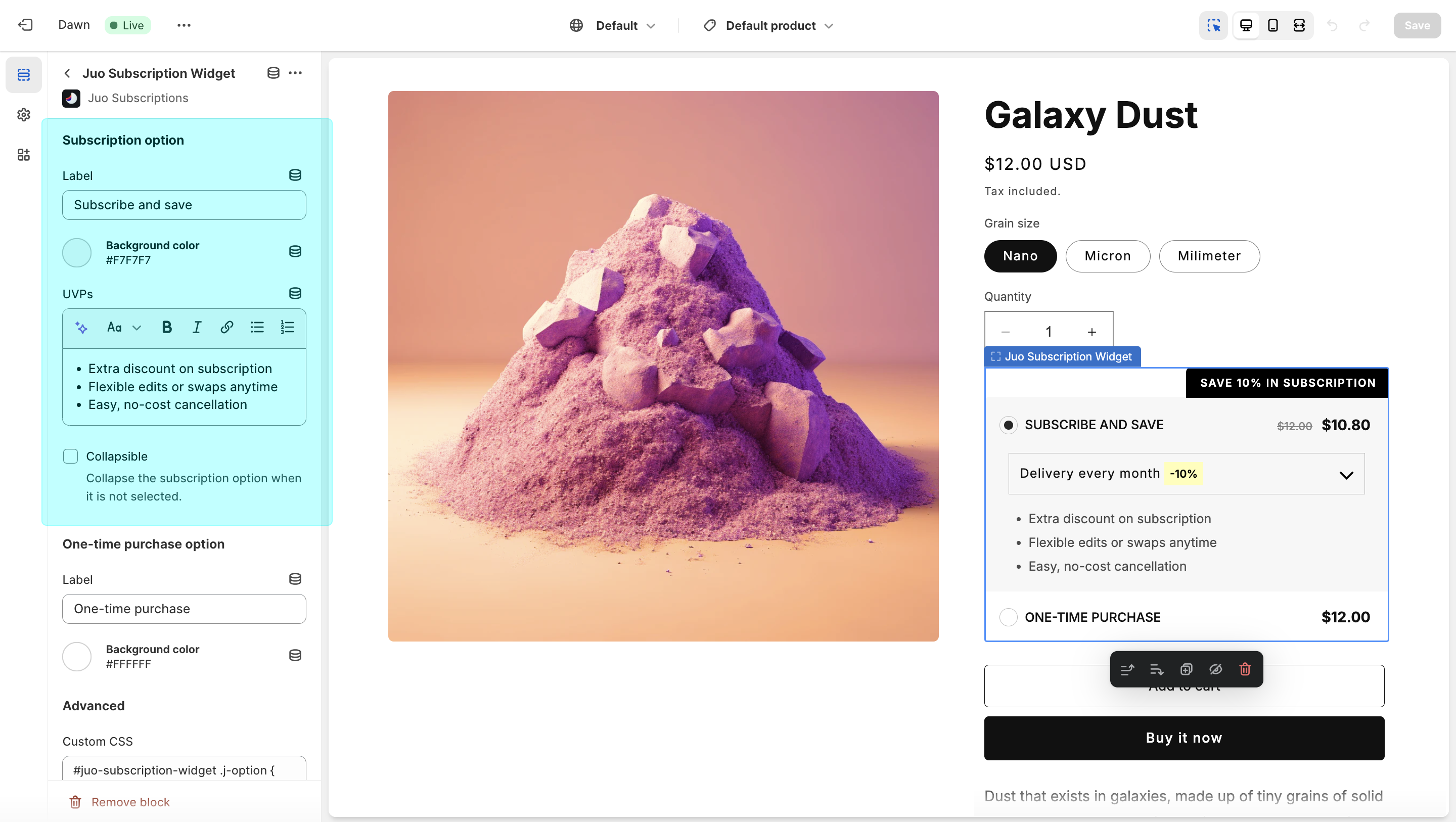
## Subscription option
This section allows you to customize how the subscription option appears in the widget, including its label, background color, listed benefits, and level of detail.
* **Label** — the display name for the subscription option within the widget
* **Background color** — sets the background color (available in the Basic widget style)
* **UVPs** — lets you define custom benefits for your subscription program (default options are provided)
* **Collapsible** — when enabled, hides the delivery frequency and benefits unless the subscription option is selected
## One-time purchase option
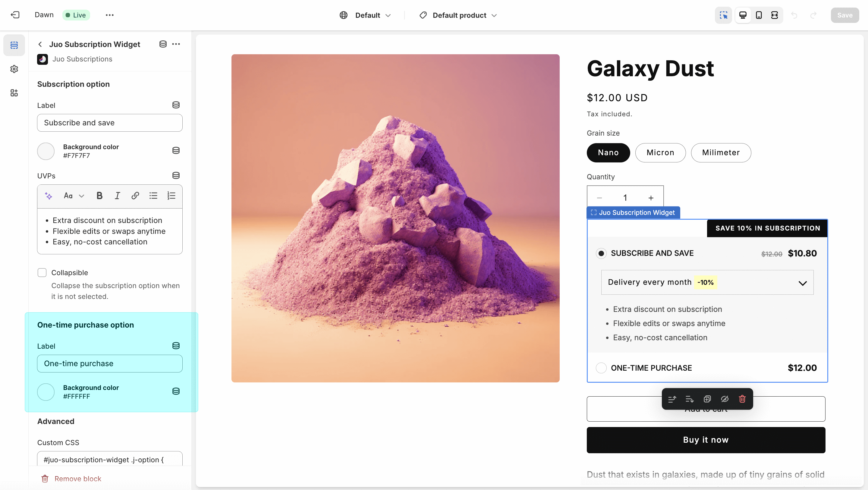
Like the subscription option, this allows you to set a custom label and background color for one-time purchases (available in the Basic widget style).
## Custom CSS
The provided settings should meet most use cases, but if you need more advanced control, you can use the custom CSS option.
If you can’t see the Juo Subscriptions Widget block, find out how to add it to your theme [here](/guides/adding-juo-subscription-widget).