Customizing the Juo subscription widget
The Juo widget comes with flexible customization options that allow you to tailor its appearance to match your Shopify storefront. To get started with customization, go to your default Product page template and left-click on the Juo Subscription Widget. This will open the settings panel, where you can adjust the appearance of the widget to your current theme.
General settings
These settings apply to the general widget appearance, including the style of the widget, corner radius, font weights, some color settings, and the top and bottom margins.
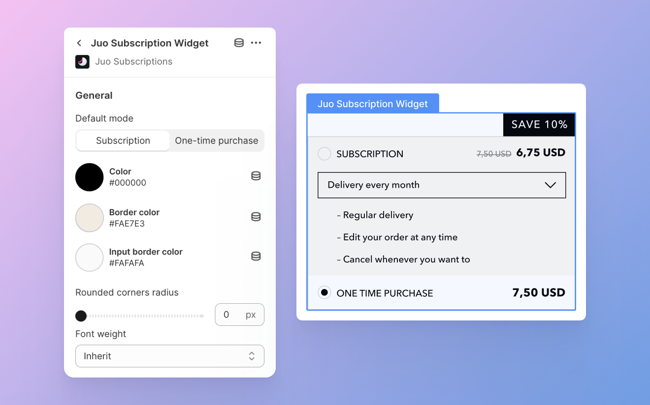
Widget style
You can choose between two different widget styles currently: Basic and USPs. Basic is a simple style that will suit most websites, while USPs is more adorned, with stylized fonts and an additional highlight on the subscription discount.
Some settings only apply to one widget style. While still visible in the settings panel, non-applicable settings will not show up on the widget in the Shopify theme editor.
Default mode
You can have either subscriptions or one-time purchases selected by default in the widget. Choose the option that you want to prioritize in your store.
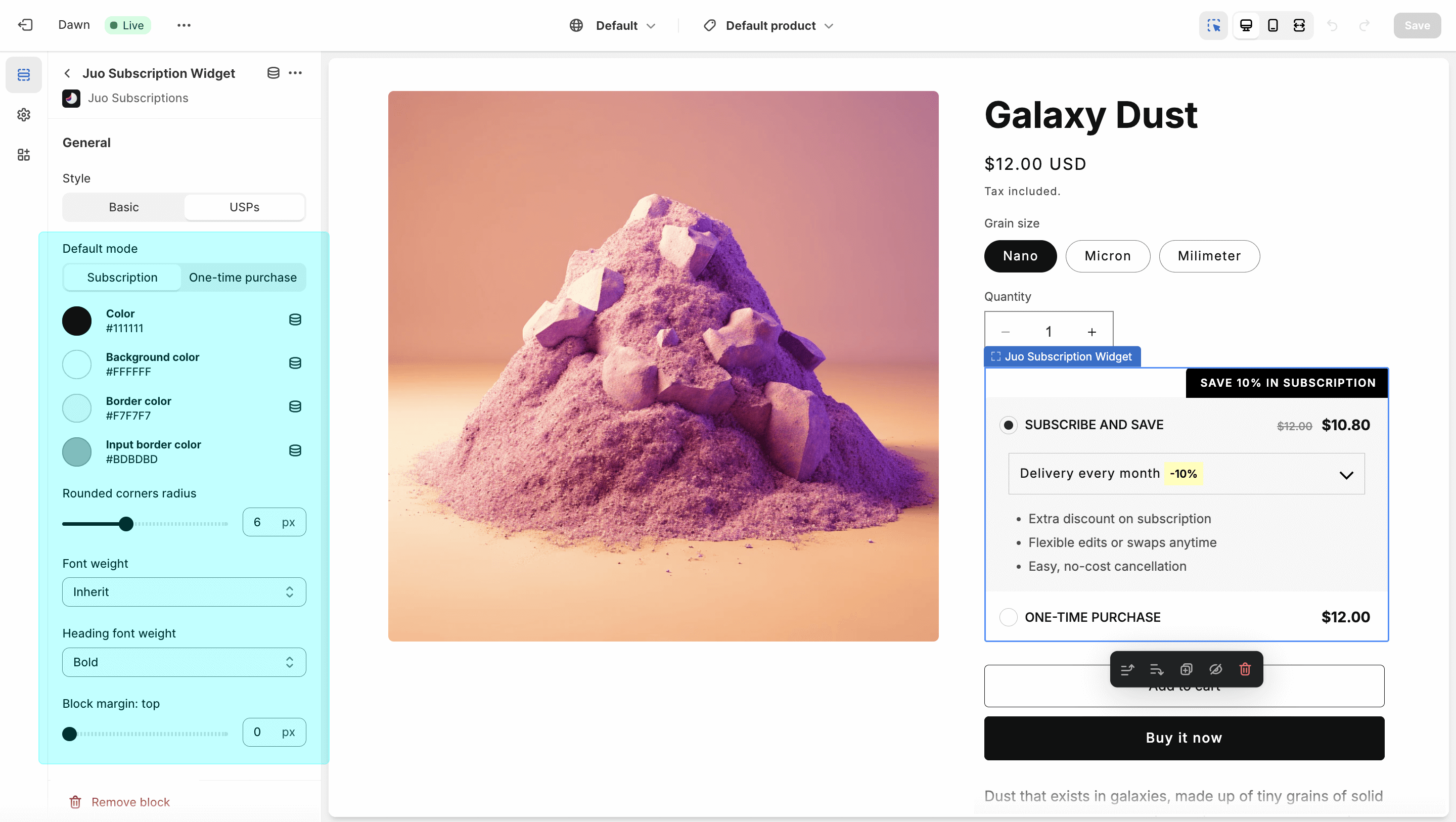
Colors
There’s a number of color settings for you to adjust for the entire widget:
- Color — changes the color of the fonts used in the widget
- Background color — changes the color of the widget background (for the USPs style)
- Border color — adds a colored border to the entire widget
- Input border color — changes the border color for the delivery frequency selector
Apart from the settings above, you can also adjust the subscription and discount badges, and choose different background colors for subscription and OTP purchases (for the Basic style).
Corner radius
Depending on the design of your store, you can use straight or slightly rounded corners for the widget and the subscription badge above it. Use the slider to pick between 0 and 16 pixel corner radius.
Top and bottom margin
You can increase the spacing between the widget and its adjacent elements with the top and bottom margin settings.
Block margin: top increases the spacing between the widget and the element(s) immediately above it, and block margin: bottom with the elements below it.
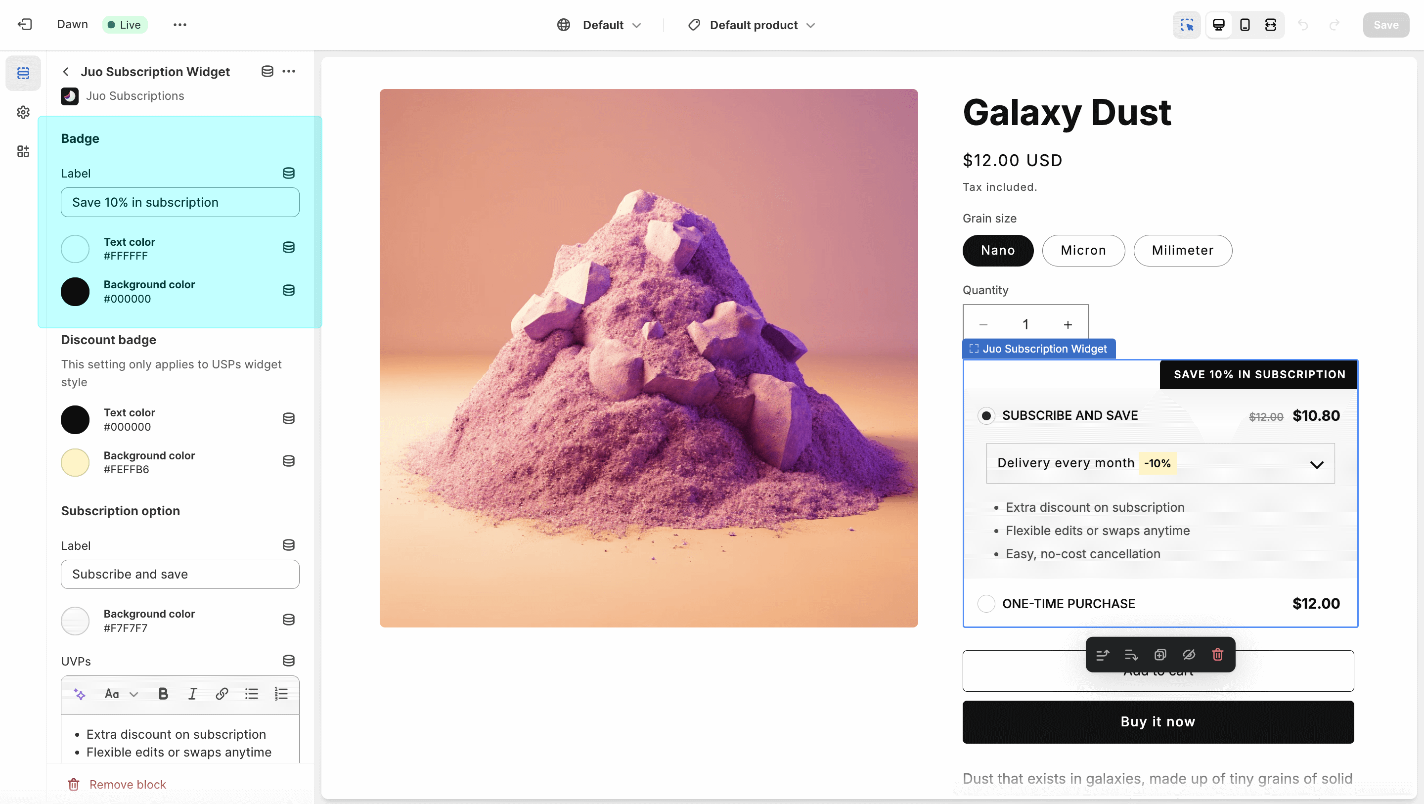
Subscription badge
You can change both the label and the colors of the badge that appears above the subscription widget. Choose contrasting text and background colors to make sure the badge is visible above the widget. If you don’t want the badge to display, just leave the “Label” field blank.
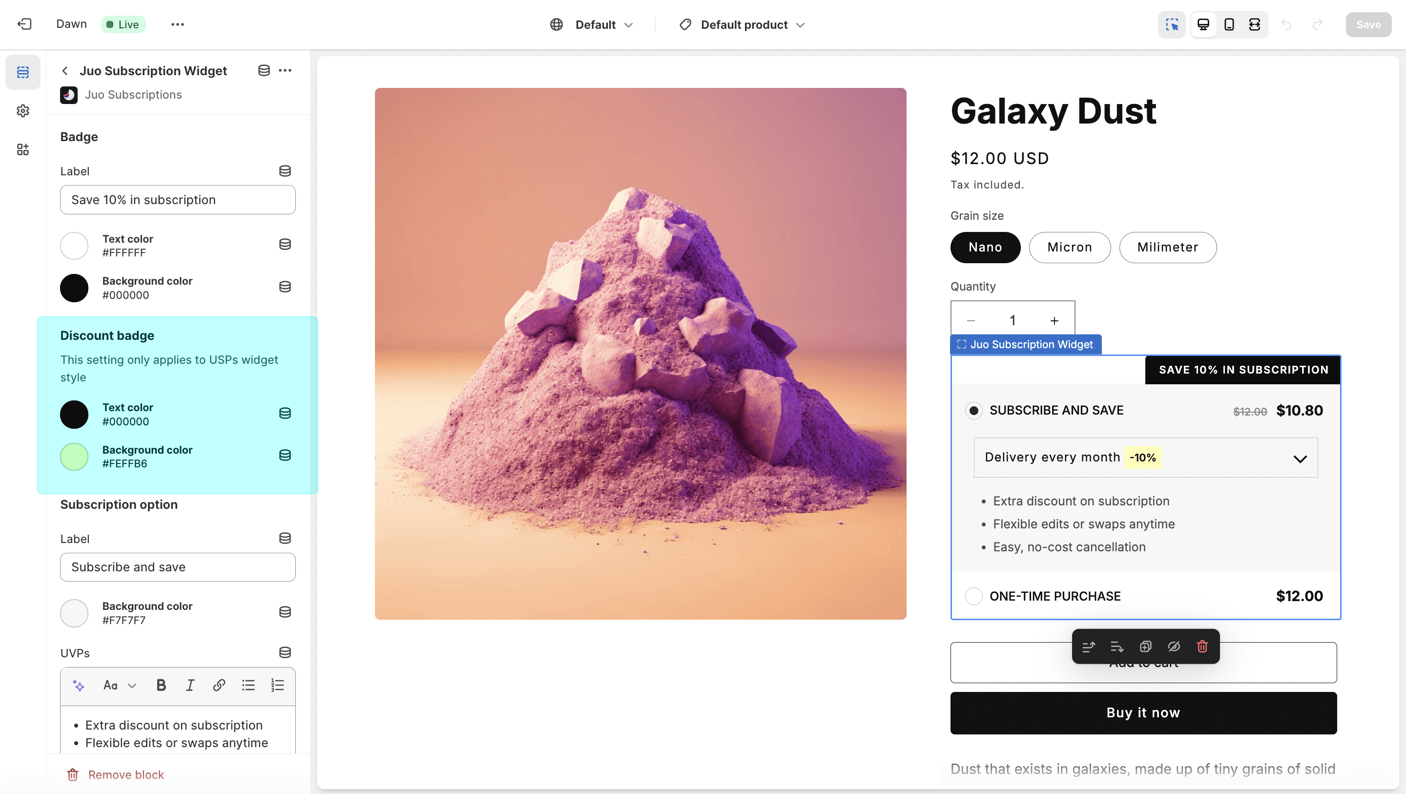
Discount badge
This option is only available for the USPs widget, which has a discount highlight displayed next to the delivery frequencies selected from the widget. Your can adjust both the color of the highlight and the color of the text that showcases the discount.
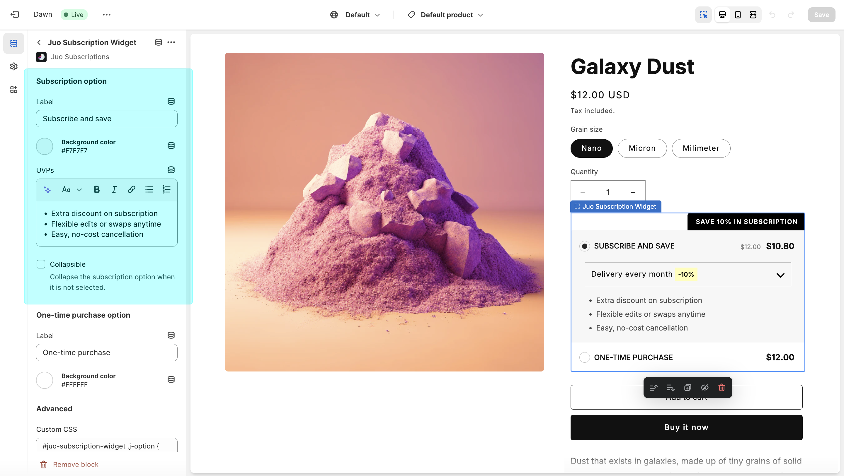
Subscription option
This section allows you to customize the subscription option in the widget, including the label, background color, additional benefits and the amount of information displayed.
- Label — this is the name under which the subscription option will be displayed in the widget
- Background color — this is the color that will be used as a background for the subscription option (available for Basic widget style)
- UVPs — this field allows to provide custom benefits for your subscription program and display them in the widget (default benefits are provided for you)
- Collapsible — if turned on, this option will hide the delivery frequency and the benefits when the subscription option is not selected in the widget
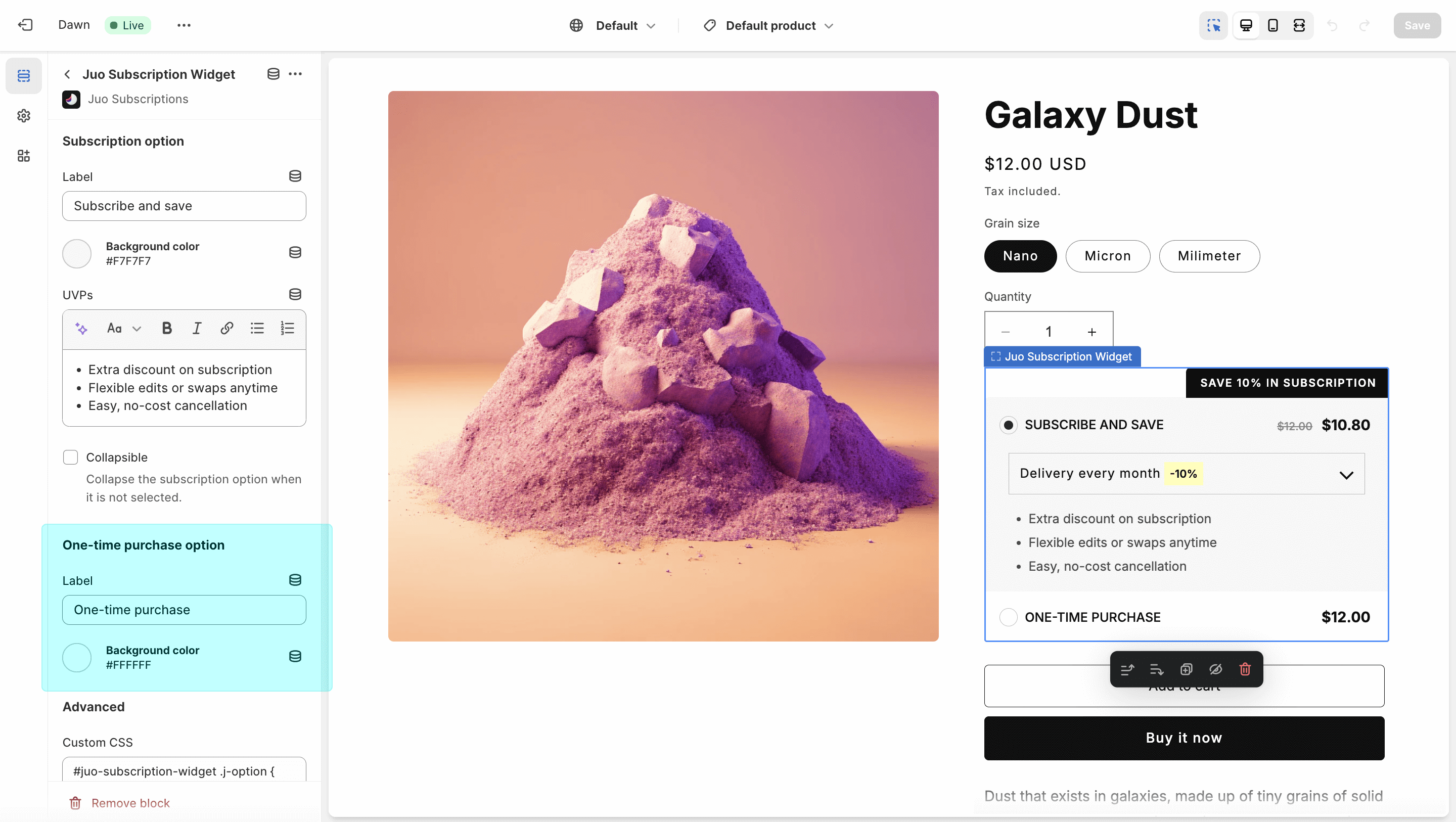
One-time purchase option
Similar to subscription option, you can provide a custom label for one-time purchases and choose a custom background (in the Basic widget style).
Custom CSS
The available customizations should cover most use-cases, but if your storefront needs more advanced customizations, the custom CSS option is also available.
If you can’t see the Juo Subscriptions Widget block, find out how to add it to your theme here.